The Power of Color: How Palettes Shape Emotion, Behavior, and Brand Perception
The Power of Color: How Palettes Shape Emotion, Behavior, and Brand Perception
A deep dive into the psychological impact of color, and how intentional choices can make your designs
A deep dive into the psychological impact of color, and how intentional choices can make your designs
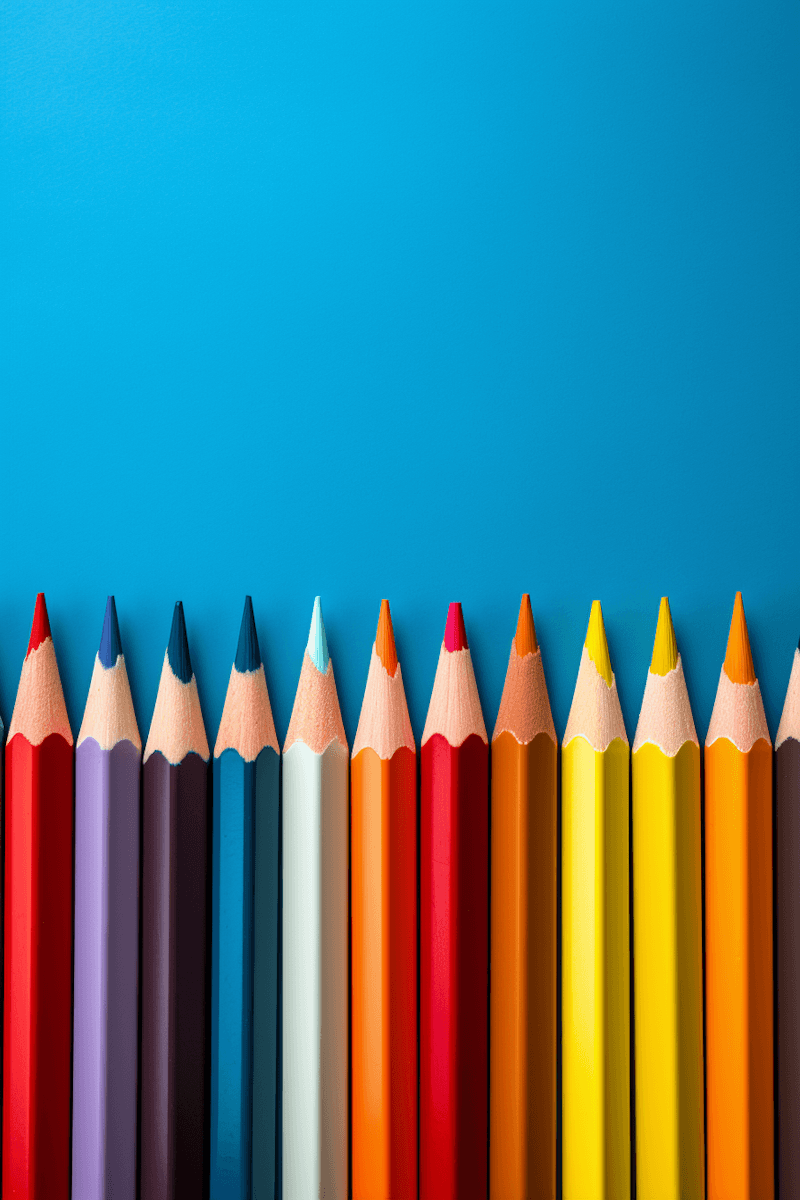
Colours
Whilst before, many people might associate remote working with nomadic freelancers, Instagramming their Macbooks in exotic locations, this was the reality for only a minority of people. Today the majority of the workers, 70% of full-time workers in the United States, work directly from home
Color is everywhere, and yet we rarely stop to consider how much it influences our daily decisions.
From the branding of your favorite tech product to the background of a meditation app, from the shade of a CTA button to the walls of a hospital—color is quietly guiding how we feel, react, and connect.
At Hue & Theory, we believe color is more than an aesthetic choice. It’s one of the most powerful tools in a designer’s toolkit—capable of evoking emotion, establishing trust, enhancing usability, and even influencing purchasing behavior. Yet it’s often misunderstood, misused, or chosen based on trends rather than intention.
This blog is a deep dive into the true power of color in visual design. We explore not just what colors look like, but what they do—how they affect user psychology, brand recognition, accessibility, and emotional resonance. In this post, we’ll cover:
The psychology of color and how different hues trigger specific emotional responses (e.g., why blue builds trust and red signals urgency)
The cultural context of color and why the same palette can mean vastly different things across cultures
How leading brands like Spotify, Airbnb, and Coca-Cola use color systems to create strong identities and emotional connections
Tips for building intentional, brand-aligned color palettes that support hierarchy, usability, and mood
A look into accessibility and contrast, and why inclusive color choices are essential for user-friendly design
Tools and frameworks (like HSL, color wheels, and semantic naming) to improve how you choose and apply colors in your work
We’ll also examine real-world case studies where color made—or broke—a user experience, and share a few timeless principles that can help you create palettes that don’t just look good, but feel right.
Whether you’re a visual designer, a UI/UX strategist, or someone who simply wants to better understand why color matters, this blog will give you new eyes for how you use it.
Because color isn’t decoration—it’s communication. And when used with intention, it can speak louder than words.